
Outfit Guide for Your Photo Shoot
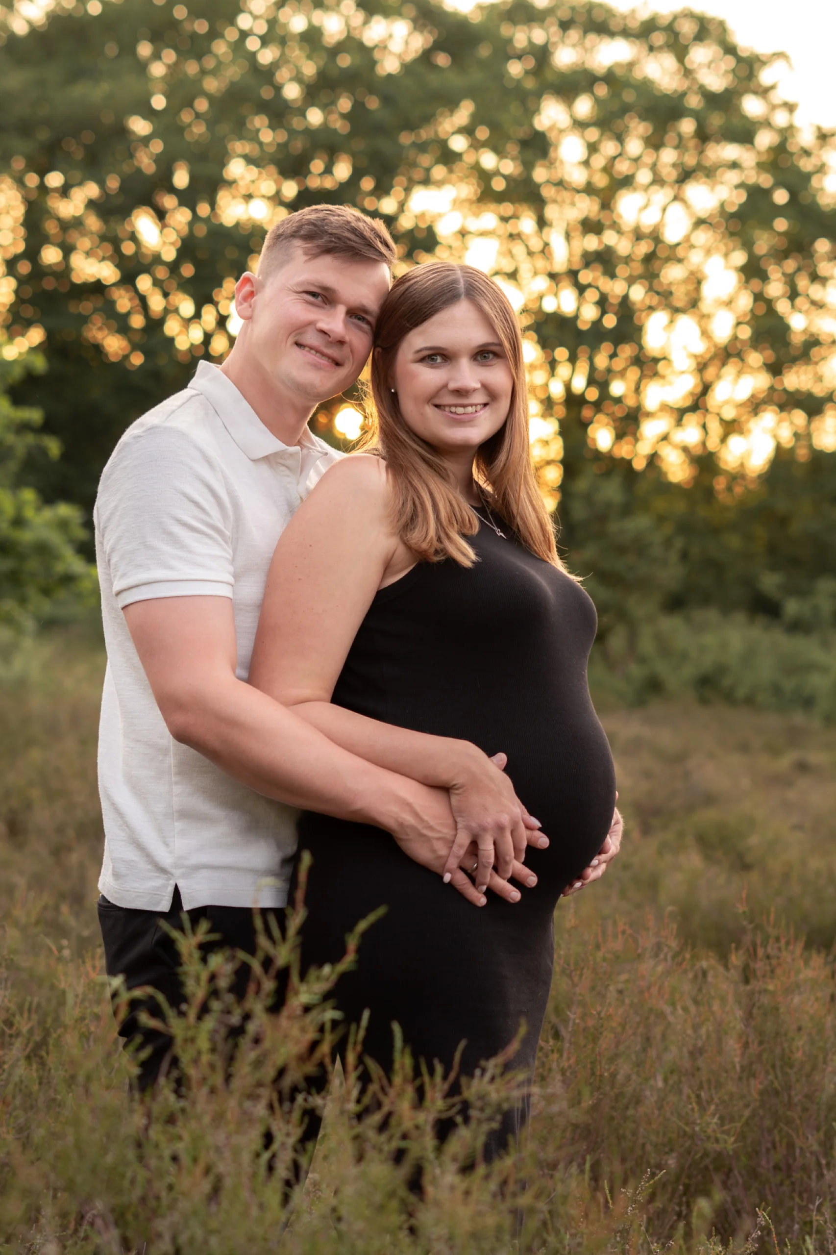
Short answer: reach for calm, natural tones instead of bold colours like red or purple, skip large logos and text prints, and if there are two of you, it's not about matching exactly but about tones that go well together. The decision gets much easier once you're working from a shared moodboard beforehand.
Why colour matters so much
Bold colours like strong red or purple pull an enormous amount of attention in a photo — more than your faces do. Natural tones like beige, cream, olive, terracotta or muted blue let you stay the focus instead, and they work harmoniously in almost any location and light, especially during golden hour.
A simple test: picture your outfit in black and white. If it looks calm and coherent there, it usually works in colour in front of the camera too. If it already looks busy or patchy, that's often a sign of too much contrast or too many patterns at once.
For couples: coordinated, not identically matched
You don't need to appear in identical colours or patterns — that quickly looks unnatural in photos. It looks lovelier when your outfits share a similar colour family or mood: both in warm earth tones, for example, but not in the exact same garment. That way you read as a unit without looking dressed up in costume.
A small rule of thumb that helps me personally: one person a shade lighter, the other a shade darker, within the same colour family. That creates enough contrast for both of you to stand out clearly, without it looking like a deliberate matching outfit.
What I'd generally steer away from
Big logos or text prints — a bold Nike logo across the chest, say — pull focus in the photo and tend to date quickly. Very fine patterns (narrow stripes, small checks) can also "shimmer" oddly in photos. Simple is almost always the better call here.
I'd also avoid completely new, never-worn clothing — it's surprisingly obvious in photos when someone hasn't quite moved in an outfit yet. Try wearing that special piece around the house once before the big day, just to break it in.
My Pinterest board as a starting point
If you don't have your own idea, feel free to browse my Pinterest board — I collect outfit inspiration there that fits my style. What matters most, though: in the end, it's your own moodboard that counts, not mine. If you dress entirely against your own taste just because it seems to "fit the photographer", nothing ends up feeling right — not the photo, and not how you feel in it.
So use my board as a starting point for colours and silhouettes, but translate it into your own wardrobe. The loveliest photos happen when clothing and personality actually match — not when a borrowed concept is simply laid on top.
Small details people often forget
Think about shoes and accessories too — they're rarely the main subject, but they show up in a photo more often than you'd expect. Comfortable shoes beat new, pinching ones, especially if we're walking to a location. And if you're having your hair or makeup done specially, build in a bit more time than you think you need, rather than rushing out the door at the last minute.
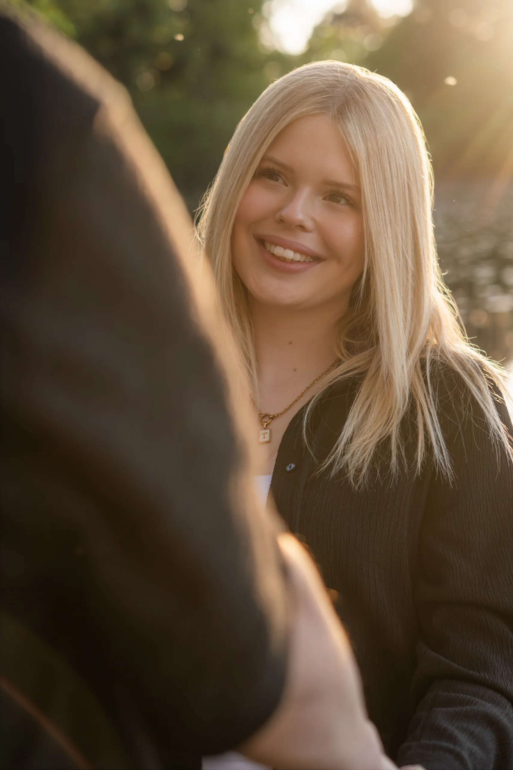
Not sure about your outfit? Just send me a photo you like — I'll tell you if it works.
Visit the main site– Hannah